Some years ago, I did a little tutorial about
rescuing ugly fabric, so today I thought I'd revisit the subject, this time with paper.
You know the ugly paper I'm talking about: those old scrapbook pages you keep around despite the fact that they have little yellow duckies all over them
and that you never scrapbooked a day in your life; the gelli'd pages that yielded shockingly bad color combinations on only the second or third pull; and the ones that, no matter how much time and effort you put into them, make you want to stuff them down deep into the bottom of the garbage can. Now, we all know that there's a way to rescue such relics from the bottom of the last drawer of art supplies you will ever open: gesso. Yep, paint that crap right away with a fresh, clean coat of white.
But what if there are parts of the paper you still really like, little bits where colors and texture met and became something glorious and fun? You can't paint over those and lose them forever! But taken as it is, you'll never use any part of the paper!
The answer is simple... preserve those bits and cover over
everything else.
Here are a couple examples of some really ugly papers I've painted in the last few weeks that also have some fun bits I want to preserve.
The first one is long and narrow, and has unfortunate, triangular
splotches that don't really create a pleasing composition. This isn't
art, and as it is, it doesn't even qualify as a usable background for collage.
But it has some redeeming qualities- the color palette is pleasing, as
is some of the color shifting. The texture in some areas is interesting,
and the stamped text makes for a nice, small-scale noise.
I began rescuing it with some opaque titanium white paint sponged gently through a stencil. (The stencil is Stacked Journaling, cut from heavy paper.)
Some of that great color and texture still shines through, but the over all composition has suddenly improved. I could have left it like this and used it whole as a collage element. But I almost never know when to say, "When!" so I added another layer of blue, that falls off the edge of the paper.
And then a finally little layer with a darker blue.
Now I have what I consider to be a workable piece of ephemera.
In the next piece, I had a lot of obstacles to overcome.
A weak, muddied color palette and insipid make-making made this a prime candidate for more and more layers of paint.
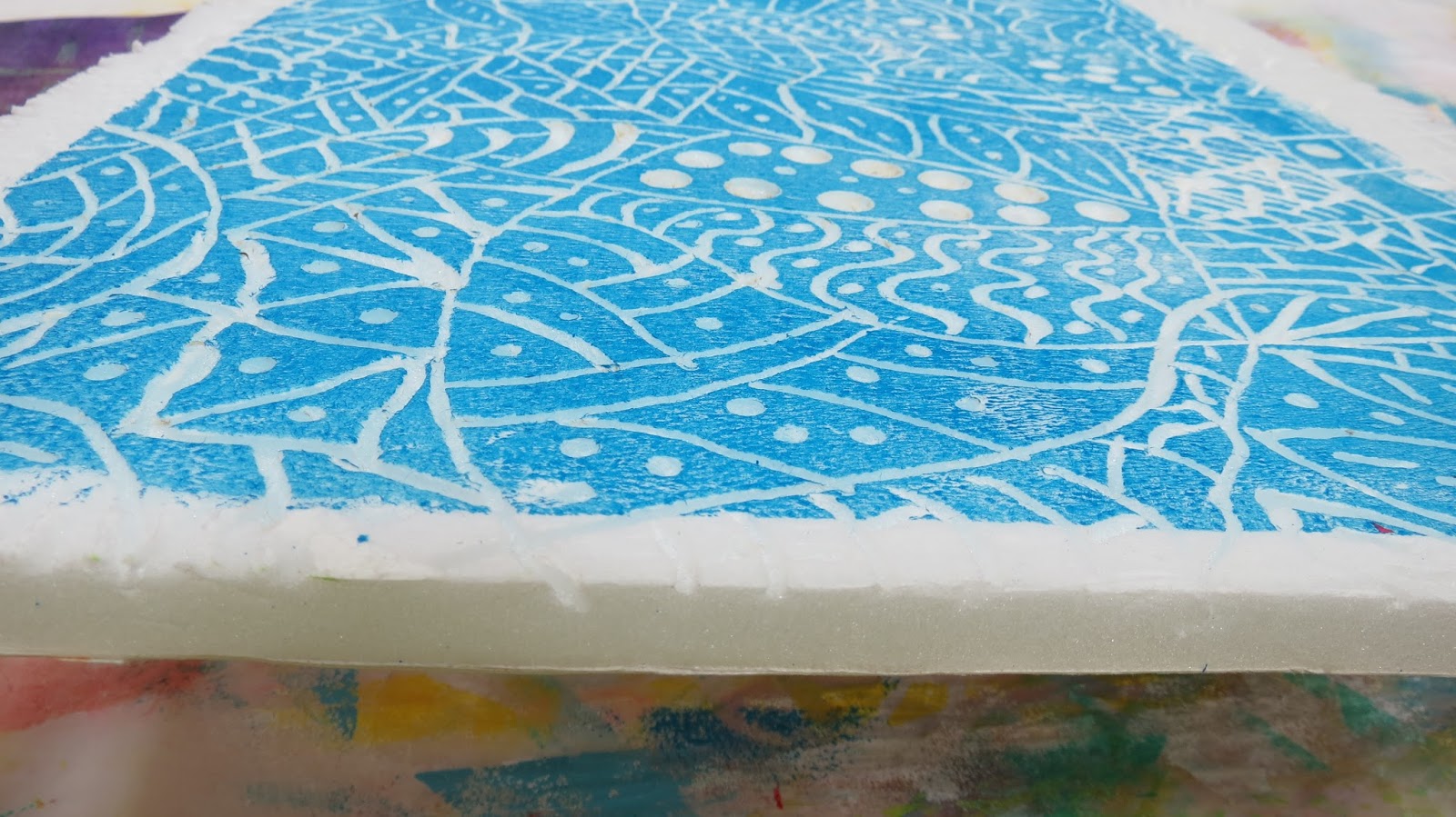
Instead of using stencils with this one, though, I used a huge, carved printing block I made by burning into foam core with a wood-burning tool.
Again, wanting to have a clean palette to work with in subsequent layers, I started with white.
That gave me good coverage of small-scale patterning that I could paint over with brighter colors and know I wouldn't be muddying things further. But did I do that? Of course not. Instead, I made the ridiculous error of going right back into it with a dark violet.
It was an impulsive choice, and the paper paid the price: it was once again a dark, ugly mess. Panicking, I began layering lighter and lighter opaque colors on top, using the same printing block. As each layer of paint went on, but before it had a chance to fully cure, I used a damp baby wipe to dull and fade it, grunging it up until I was finally satisfied. I didn't get photos of the whole process because I get so caught up in the process of layering and wiping back that I forget to stop between each layer and take pictures! Please trust me when I tell you, though, that this really is the result of layering with the same printing plate, over and over, in different colors...
Even with so many new layers of paint on top of it, the quirky character of the original paper still peeks through in places.
The lesson here is simple: there isn't anything that can't be fixed with more paint.
~~~~~~~
While puttering through the studio this week, I came across an astonishing find. I'm not even sure how I managed to forget about this, or why it took me so long to see it, sitting right out there, staring me in the face, but I'm thrilled I did...
A huge stack of large sheets of creamy white handmade printer's paper.
I haven't measured it, but I'd have to guess that it's about 30" long by 20" wide.
(lovely, deckled edge)
And there's so much of it, there must be 50 sheets!!
When in the world did I purchase this treasure trove? It must have cost a small fortune, and yet I forgot all about it?? Artistic dementia, I suppose.
Finally today, these pieces, offered with little explanation because I don't know where this idea is heading, yet. They are all three
8"x10" wooden cradle board, acrylic paint on synthetic paper (scroll about halfway down this link to see Texoprint paper), masked Stacked Journaling.
(detail)
(detail)
Until next time, create over ugly (what do you have to lose?)


