Thursday, August 4, 2016

Start. Stop. Start. Stop. Complain.

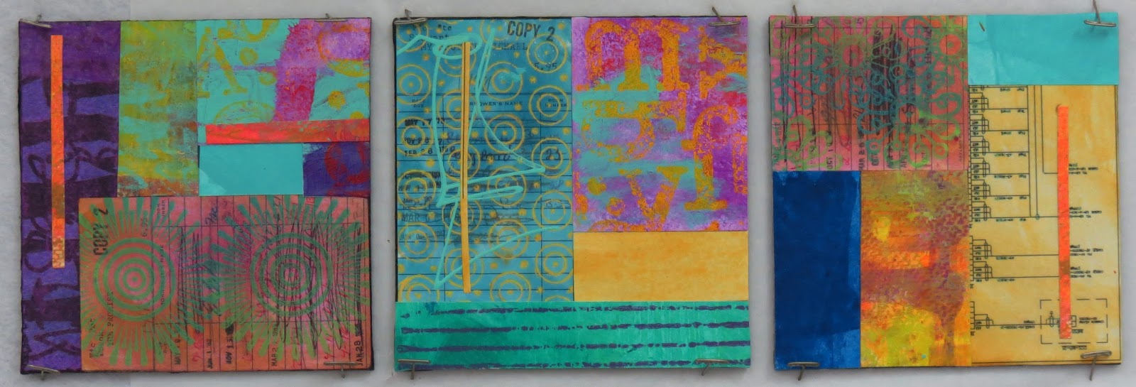
Some progress in the studio this week. Still pushing at SJ to see what it can and cannot do.

This little piece is a collage of more layers than you might think. It starts with some electrical schematics for a Mustang, generously donated by a neighbor. The schematics have great lines and labels all over them. I tossed in some snippets from my grandmother's accounting books, some painted tissue, and a micro cutting of some tiny SJ.

(12"x12", acrylic paint and vintage collage on cradled wooden panel)

There was also a lot of stalling this week. You know... starting, full of excitement. Stopping hours later, disappointed. Weird stuff often comes out of that, for me. Like this, offered with no explanation because I couldn't possibly.


Yes, that's painted cotton hanging off of it. I don't know why. It's 12"x12" too, for whatever that's worth. 

When I have disappointing studio sessions several days in a row, I retreat back to comfortable exercises. It's usually a confidence builder and allows me to push through the tough hours until I get somewhere that makes me happy.

Painting helps.


So does collage (and I've promised myself that when I die, every bit of ephemera I've been collecting and painting all these years will be used UP, so that'll be a bonus for my family!)


Finally, towards the end of the week, I hit on something that intrigues me. I'll be playing with this more and I won't be explaining it until later. But this is the first somewhat interesting result.


Until next time, push on and create happy!

Friday, July 29, 2016

The End of a Rainy Week

The weather has been so icky that I've spent a lot of time in the studio this week.

I'm continuing to work through my ideas for cutting up Stacked Journaling and laminating it onto various substrates, from paper to wooden panels.

(paper on paper, 8"x10")

Some work...

(Multi-Purpose fabric on Multi-Purpose fabric, 11"x23")

(acrylic on paper, 8"x11")

... is more successful than other work...

(Multi-Purpose fabric on wooden panel. 9"x12")

Ah, well.

Until next time!

Sunday, July 24, 2016

New Experiments and a Pro Tip

I've been doing more experiments with cut Stacked Journaling, playing with the scale and line thickness of my lettering. So far, these have all been done with some type of paper, from mat board to 60# copy paper. I'm also playing with contrast between the background layer, which is usually just painted, and the foreground Stacked Journaling.  


Normally, the smaller the printing I use when Journaling, the more linear the design gets, as in this piece below. This isn't a bad thing, but it isn't always what I'm looking for.


It seems that the larger I go with my printing, the better I like it, and letting it fall off the background, along with its more open shape, makes the whole process feel more liberated, to me.


My favorite pieces so far have been the ones with a vibrant colors (big surprise, huh?) but I plan to do more experimenting with neutral colors and a black-to-gray scale. 

Also, being a frugal artist, I wanted to share this little pro tip with you today. If you're like me, you've collected your fair share of alphabet stamps. Frankly, I stopped using them years ago, but I uncovered them recently, and wondered what kind of background noise they're create if they were all stacked together willy-nilly and held together with rubber bands.


Easy-peasy.

As I was constructing my new tools, the little vulcanized rubber letters kept falling off the posts (these sets are probably 10+ years old by now).


Not one to waste an opportunity, I got out the Elmer's and glued the letters together on their own wooden block.


Three new mark-making tools in about 10 minutes! These little things make excellent, repetitive patterns.


Until next time, create (your own tools!)

Saturday, July 16, 2016

Cutting Myself A Little Slack

I wonder if I'm the only one who does this? I look back on my studio practice now and then and become convinced that I haven't been producing any work I'd be willing to show. Sometimes that's true, and sometimes it isn't.

Examining the last few weeks, I was surprised to realize that I've been very productive.

I've been returning to my earliest roots: painting paper. There was no plan for how I produced several dozen papers, except that I kept the color schemes similar so that I could collage with them later. I painted with thin, transparent layers of acrylic, monoprinted, stamped, and painted some hand-written Stacked Journaling, working from one sheet of copy paper or other old, printed material, to another.


After I had a large stack ready, I cut them up and applied them to all types of substrates. Paper...


On 6"x6" flat, canvas panels...


 And on cradled, wooden panels of various (small) sizes...


Still using the wooden panels (my favorite substrate of all, seriously), I painted directly onto the unprimed wood to get a stain effect and then applied some- follow along with me, here- monoprinted, cut Stacked Journaling. (Monoprinted, cut Stacked Journaling is described in this post.)


I've also been revisiting my love of old, yellowed papers. With this very large wooden panel (30"x40"x2"), I primed the surface and then collaged encyclopedia, dictionary, and thesaurus pages on the theme of trees and birds onto it. A couple of layers of thinned paint and a good sanding with my palm orbiter gave it a nice patina while serving to push back the background. I'm doing some studies before touching it again, because I want to be sure I know just what I want to do before start, so watch this space.


Finally, sitting on my workspace in front of me, is this gorgeous hunk of wooden panel, 16"x16"x2", in its first stages of paint.


Instead of using paper collage elements, I decided to use multi-purpose fabric, so I'm painting two large pieces at the same time as I paint the panel, again, keeping things in the same color family.


I guess I need to cut myself some slack- I'm producing plenty of work.

Until next time, paint happy!

Thursday, June 30, 2016

Long Lost Artist

Hi, everyone! I know it's been a very long time since I posted to this blog, but I finally finished a project that has been literally months in the making. Back in October, I made a promise to Judy Gula, a beloved friend and proprietor of Artistic Artifacts, a brick and mortar store with an online outlet for every possible thing you might seek when creating fabric and mixed-media art, from paints to ephemera, to funky and unique add-ons.
 
Judy also sells gorgeous, hand-carved wooden printing blocks in both her online and B&M stores, and she generously gifted me the selection you see in the photo, below. In return for her wonderful gift, I promised to create a project with them and write a blog post.


And then this giant beauty crossed my path.


Purchased from a neighbor for the bargain price of 30 dollars, I knew I had found my project.

The upholstered arm chair, a rocker/glider combination, had been in her son's nursery, used to rock him and feed him as an infant. The chair was in spectacular condition and didn't need a thing, except maybe another baby, because it was covered in nursery fabric.


It was so precious, and the fabric so beautiful, that I almost hesitated to touch it. However, I wanted a chair for one of my upstairs guest rooms, and nursery fabric just wouldn't cut it.

So I took at it with some Jacquard fabric paint in opaque white, as a primer.


Now, let me just tell you how much I love Jacquard fabric painting products. Ok, just kidding, that would take days and days and days. Let's just say that they make an entire line of paints just for fabric alone that I could paint with exclusively, if I wasn't such a paint junkie that I buy all manner of other artist colors from other companies!


The opacity of the "opaque white" cannot be overstated- it really is thick, creamy, titanium white and the coverage it offers is phenomenal. (No, I'm not getting anything for plugging Jacquard, I promise, they're just that good!)

After getting a coat of the primer on, I dove into colors.


Knowing that I wanted heavy layering of colors and textures, I started with the lightest colors- the two yellows.


Working in mostly broad stripes, I applied the paint with a damp automotive sponge.


Then I moved onto magenta, overlapping it with a bit of the yellows, mixing color on the chair as I went.


In the above photo, you can see that I had also begun to apply the same paints in white, two yellows, and magenta with some of the wooden blocks. I used the same colors as the base colors, particularly the white, to create a resist for later, darker layers.


This is where I fell down on the job, in a number of ways. The first was that I got a bad case of Artist Lock. You know the stuff, when you've already invested a goodly amount of time on a project and now, even if you KNOW what you want to do next, you freeze for fear of destroying it. Yeah, it grabbed me for months on end, as the chair sat in my studio, mocking my inability to move forward on it. Some art is like that, it teases you and makes you feel like you couldn't possibly be up to the task. That's when it's crucial to the artist's soul to remember that the reason a particular work feels that way to you it's because it's not finished, yet.

The second is that when I finally broke my freeze, so many months had passed that I was afraid that if I stopped to take photos, I would freeze up again. Instead, I attacked the chair with dark colors like Navy and Fluorescent Violet, covering much of the white and overlapping with the yellows and reds (and their resulting oranges.)

Even then, I didn't take pictures. It wasn't until I felt like the piece was finished that I gave myself permission to commit it to photographs.


Having planned all along to pop the details and color blends by reintroducing white, I created a simple stamp with a piece of fun foam and an old stamping block. Then, using more of the opaque white paint, I began stamping.


Even at this stage, I wasn't certain that I was finished with it- or even liked it! Did it need more colors? Is it already too garish and busy?


And then I began to notice the tiny details. 


I really liked the way the stamped white shapes interacted with the colors underneath.


These are details you can't see from a distance, but up close, they're delicious. I'm satisfied.

My only regret for the whole project: that I didn't take the ottoman my neighbor was also selling!

Happy summer, happy creating!