Showing posts with label collage. Show all posts

Sunday, July 24, 2016

New Experiments and a Pro Tip

I've been doing more experiments with cut Stacked Journaling, playing with the scale and line thickness of my lettering. So far, these have all been done with some type of paper, from mat board to 60# copy paper. I'm also playing with contrast between the background layer, which is usually just painted, and the foreground Stacked Journaling.  


Normally, the smaller the printing I use when Journaling, the more linear the design gets, as in this piece below. This isn't a bad thing, but it isn't always what I'm looking for.


It seems that the larger I go with my printing, the better I like it, and letting it fall off the background, along with its more open shape, makes the whole process feel more liberated, to me.


My favorite pieces so far have been the ones with a vibrant colors (big surprise, huh?) but I plan to do more experimenting with neutral colors and a black-to-gray scale. 

Also, being a frugal artist, I wanted to share this little pro tip with you today. If you're like me, you've collected your fair share of alphabet stamps. Frankly, I stopped using them years ago, but I uncovered them recently, and wondered what kind of background noise they're create if they were all stacked together willy-nilly and held together with rubber bands.


Easy-peasy.

As I was constructing my new tools, the little vulcanized rubber letters kept falling off the posts (these sets are probably 10+ years old by now).


Not one to waste an opportunity, I got out the Elmer's and glued the letters together on their own wooden block.


Three new mark-making tools in about 10 minutes! These little things make excellent, repetitive patterns.


Until next time, create (your own tools!)

Sunday, September 25, 2011

The Sketchbook Challenge EZine!

Stop the presses!  The first Sketchbook Challenge E-zine is now available for purchase!


The Sketchbook Challenge E-zine is 83 full color pages of creativity, inspiration and projects!

What you’ll find inside...
Learn how to draw a pinecone with Jane LaFazio
Exploring Text Collage with Kelli Nina Perkins
Make a Scrappy House Quilt with Jamie Fingal
Working in series by Jane Davies
Make bad art with Lyric Kinard and become a better artist
Sue Bleiweiss shows you how to make a sketchbook sleeve
Carol Sloan shares her remedies for blank pages
Take 5! with Carla Sonheim
Screenprinting for the Mixed Media Artist by Leslie Tucker-Jenison
Take your sketchbook out to eat with Susan Sorrell
Stacked Journaling with Judi Hurwitt
Learn how to use your inner GPS to create journal pages with Violette
Learn a trio of pamphlet binding stitches from Diana Trout

Important information regarding printing this document for binding:This e-zine has been formatted for on screen viewing. If you want to print a copy to have bound then you must scale the document to 90% to allow for a wide enough left side margin. In the print box, select the scale option and change it to 90%. Please print a test page first (we recommend page 5) to make sure that the setting is appropriate for your printer before printing the entire document.

The Sketchbook Challenge E-zine is in pdf format and include step-by-step instructions and full-color photo illustrations. You must have Adobe Acrobat Reader 5.0 or higher to be able to open the lessons. Adobe Acrobat Reader is a free software that you can download from the Adobe Website. 
POST A REVIEW AND WIN A PIECE OF MAIL ART!

Post a review of the sketchbook challenge e-zine on your blog or website and we'll enter your name into a drawing to win a piece of mail art from one or more of the Sketchbook Challenge artists!  Send a link to your published review by 12/1/11  to sue at sue@suebleiweiss.com to be entered into the drawing.  Winners will be announced in December - good luck!

Thursday, August 26, 2010

Off To Fabrications!

On Sunday morning, I leave for a week-long workshop at Fabrications in Kalamazoo, MI., with Carol Soderlund called Color-Mixing For Dyers. I'm excited to go and while I wanted to pretend I was on vacation all this week, my work ethic just wouldn't let me, so things got done!

Two 1-yard x 45" pieces of white Pimatex cotton got the deconstructed screen printing treatment.

After printing this piece off, I was sure it would be my favorite coming out of the washing machine.


And I am pleased with the results.

(36" x 45"- a little blurry, sorry!)

(detail)

It has some nice details, but once it was washed, dried and ironed, it looked a little blah to me. Not sure what will happen with it, next, but that will have to come after my retreat!

The second piece I deconstructed this week, which I forgot to photograph before I wrapped it up for batching, looked when it went into its plastic package like it could just wind up a blobby mess of ugly color. I held out hope that it would still wash out beautifully, but I was blown away by the result I actually got.

(36" x 45")

I used the same screen on both pieces, allowing the first few pulls on the turquoise/black piece pictured above to help soften up the dyes, and then moving it to this piece. 


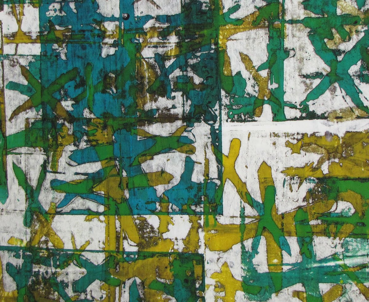
The screen was constructed easily enough. I cut wonky X shapes out of clear contact paper and pressed them onto the front of the screen. Then, from the back, I wet the screen with thickened black dye. After it had set up, I hit it with the black dye again and left it to dry for a couple of weeks. When it was dry, I peeled away the contact paper and the screen was ready to use.

To deconstruct it onto the fabric above, I started with lemon yellow print paste, covered most of the surface with pattern, and then when the yellow dye was used up, I switched to turquoise print paste, knowing it would mix beautifully with the yellow to produce a lime-y green. 

I'm excited because I feel like this is the first truly successful deconstructed screen printing I've done. From this piece, I've learned how to achieve bright, vibrant colors, and I feel like I'm beginning to add depth and sophistication to my usual color palette of bright, cool colors with the stark addition of black.  So yeah, happy all around, today!

Earlier in the week, I finished the last few 2-page spreads in my Sketchbook Project journal. I will hold onto the book for a while (I'd like to be able to show my dad when I see him in September) and then send it back to the Brooklyn Library.


The last page, pictured above, contains a listing of the materials, mediums and grounds I used to construct this book. 

I will be home again on Saturday, September 4th... until then, happy creating!

Sunday, February 21, 2010

The Dyed Silk Blahs

Well, sometimes when you goof, you do it on such a grand scale that it takes your breath away for days. That's what happened to me this week. But since it's a little depressing, we'll get to that last.

Last week, I saw a program on Ovation TV called Art Or Not? and in it, they covered an artist who worked with Shiva sticks on large canvases. He made tiny marks all over the canvas with the paints, using them like crayons and adding layer after layer of colors until the whole canvas was covered. (I wish I could tell you the name of the artist, but I don't see it anywhere on their site.)

I was inspired and thought it would be a neat technique to try with fabric, so I wacked off a large hunk of white muslin, pinned it to my wall, and drew on it.

 
36" x 52"


(detail)

It was an awful lot of fun and while I don't know what I'll do with it, yet, I'm sure I'll be able to find something neat it can go into. 

I did another kind of crazy thing this week- I used a piece of breakdown printed fabric and one of my "melted" papers from my CitraSolv/NatGeo collection (to find links to this technique, please see the left sidebar for the link labeled "CitraSolv Concentrate") to create a quilt.

 
 12" x 24"
I adhered the paper to the fabric with a very thin coating of gloss medium applied to the back of the paper and then, when dry, ironed to the fabric. It has a nice, soft hand, despite using gloss medium. 

I was really pleased with the "tunnel" stitching I did on the top of the piece. 

 
(detail)

It gave it a great texture, I think.

Also, this weekend, I negotiated a solo show for the month of May at a Houston business, a restaurant called Mo Mong. I've done these shows before- in fact, I spent three years curating such collections for several different businesses- and quite frankly, I swore I'd never do it again. However, this is a very high-profile and busy restaurant, and the owner asked for my work sight-unseen, which was flattering. I'll let you know how it goes; hopefully I can sell some of my pieces!

So, onto my silk blahs...

A very expensive batch of veils arrived last week, along with twelve pots of acid dyes. The idea was to parfait-dye them in a large vat (bucket) with all twelve dye colors thrown into the mix. For those of you not familiar with parfait dyeing, it basically means to LWI dye by scrunching a piece of fabric into a tall, narrow jar, pouring in one dye color (I always start with the lightest color, usually in the yellow family), scrunching another piece of fabric into the jar on top of the first piece, pour in another color of dye and so on until the jar is full. Batch and rinse as usual.

I had it in my head that I would do this with large silk veils, but first did several different experiments until I was happy with the results.

Unfortunately, those experiments didn't really help with the mess that was to follow when I did it on a grand scale. My dyes clotted before they could be poured onto the silk, the silk refused to scrunch enough to get even the slightest patterning, and the dye, rather than blending on each piece in a nice melange of colors, refused to blend at all, so I got several red veils, several blue, several green, etc. I didn't even take photos. They're not unattractive, just boring as hell.

This week I will try to spruce them up with some screen printing and fabric painting and if that is successful, I'll be sending them to Lynn Krawczyk, who has generously chosen Art Now For Autism as her designated recipient of her annual Breaking Traditions fund-raiser this year. My scarves, if they turn out well, will be given to participants of the auction fund raiser as thank you gifts (and if they don't, I'll be donating some of my hand-dyed muslin, instead).

Look for this week's CitraSolv/NatGeo collage in the next couple of days. In the meantime, happy creating!

Tuesday, February 16, 2010

CS. NO6

 
CS. NO6, 2.16.10, 16" x 18"

This week, now that the sun has finally come out again, I find myself craving spring. So I just couldn't help but break out the spring colors for this week's CitraSolv/NatGeo collage.

The NatGeo pages were adhered to a masonite blank in my new favorite manner: I paint the masonite and the backs of the pages with gloss medium and once they're all dry, I iron the paper to the board. The heat of the iron melts the medium and the pages adhere flatly and smoothly to the surface of the masonite.

Then I broke out my spring leaf stamps. These stamps are hand-made by adhering cut fun foam to pieces of foamcore. I painted each stamp with titanium white acrylic paint to act as a resist to the wash of color that came next.

Once the paint dried, I washed the entire surface in Sun Yellow (primary) and Turquoise (also a primary) Dye-Na-Flow and then to seal it, I covered the whole thing in a final wash of more Sun Yellow mixed into gloss medium.

 
(detail)

Tuesday, February 2, 2010

No. 4 & A New Batch

This week I kept the Citrasolv/NatGeo collage simple and used only contrast to tell my story.

 
CS NO.4, 2-2-10, 16" x 18"

Because I don't want to use up all my WonderUnder on this series, to adhere this collage to its masonite substrate, I coated both the surface of the masonite and the backs of the papers I wanted to use with gloss medium. After they dried, I was then able to use my hot iron to collage the pieces down. 

I hit it with one coat of satin finish varnish to seal it. 

 
CS NO.4, 2-2-10, 16" x 18"
I've been going through a lot of papers to make this series and I still have six or seven re-purposed masonite pieces left to collage, so today, I melted another magazine. 


With this batch of papers, I learned from a couple of my previous mistakes and some slight adjustments yielded spectacular results. Last time, I got a lot of pages that were mostly black, and a lot more that all looked very similar to one another.

This time, I was more discriminating in picking my magazine- I sought one with a lot of brightly-colored photos, rather than one with darker photos and pages. Those dark, rich photos may look luscious in the magazine, but once the ink in them melts, they can become very black and indistinct.

The second thing I did, which took only a couple of minutes and, I think, made the biggest difference in my results this time as compared with the last, was that I went through the magazine first, page by page, and removed all the pages that had a lot of text and/or black areas. This helped to keep too much black ink from permeating every page in the melting process, and kept my colors bright and strong, and the patterning on each sheet sharp and clear.